Description
Form Styler for Gravity Forms and Elementor is the missing bridge between Gravity Forms and Elementor. It adds a dedicated drag-and-drop widget to the Elementor editor that lets you embed any Gravity Form on your page and style every part of it — inputs, labels, buttons, layout — without writing a single line of CSS.
Unlike the plain shortcode approach, this widget renders Gravity Forms correctly inside the Elementor preview iframe so what you see in the editor is exactly what your visitors see. It is built specifically for the Gravity Forms Orbital theme introduced in Gravity Forms 2.5 and fully updated for the new theme framework structure in Gravity Forms 2.9+.
Looking for more advanced visual styling?
For users who want deeper, CSS‑free control over Gravity Forms (and other elements), check out our companion plugin Simple Custom Code – Custom CSS, JS, and HTML, Visual CSS Customizer. It includes a Gravity Forms Visual CSS Customizer that lets you tweak virtually every aspect of your form using interactive visual tools.
👉 Learn more about Simple Custom Code – Custom CSS, JS, and HTML, Visual CSS Customizer
Why Use This Widget?
- Accurate live preview — Gravity Forms styles load correctly inside the Elementor editor so you are always designing with a real, styled form, not a naked HTML structure.
- No CSS required — every visual property is exposed as an Elementor control. Change colors, typography, spacing, shadows, and more directly from the Style panel.
- Responsive controls — padding, margin, row gap, and column gap all support per-breakpoint values via Elementor’s responsive system.
- Clean, minimal code — the plugin hooks into Elementor and Gravity Forms using their official APIs with no hacks, no JavaScript overrides, and no style sheet conflicts.
Features
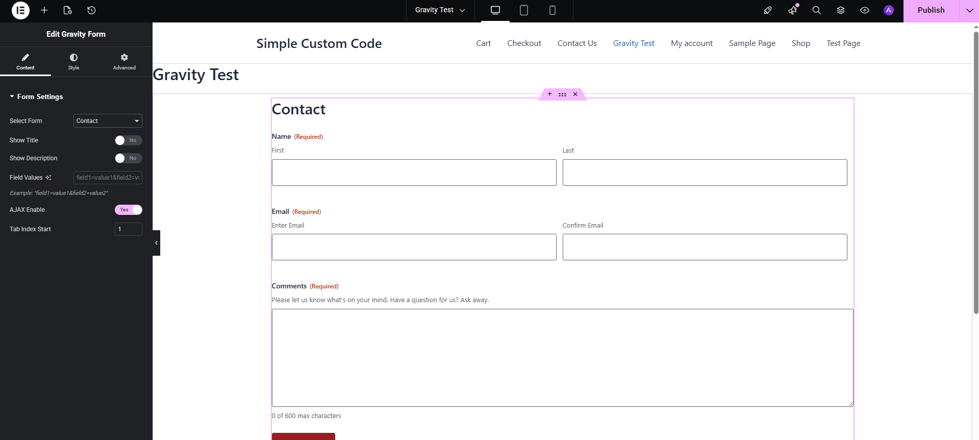
Form Settings (Content Panel)
- Select any active Gravity Form from a dropdown (placeholder always appears first)
- Toggle form title and description visibility
- Enable AJAX submission
- Set a custom field values string (pre-populate fields)
- Configure tab index start
Form Container (Style Panel)
- Padding and margin (responsive, per-breakpoint)
- Row gap and column gap between fields (responsive)
- Border (type, width, color)
- Border radius
- Box shadow
- Background — solid color or gradient
- Enable smooth transitions toggle
Form Labels
- Typography (font family, size, weight, line height, letter spacing)
- Text color
Sub Labels
- Typography
- Text color
Input Fields — Normal / Hover / Focus states
- Padding (Normal only)
- Border (type, width, color)
- Border color per state (Hover / Focus)
- Background color per state
- Typography and text color (Normal only)
- Border radius (Normal only)
- Box shadow per state — Default, None (removes shadow), or Custom
- Placeholder color and typography (Normal only)
- Focus state outline — Default, None (removes browser outline), or Custom (color, width, offset)
Submit Button — Normal / Hover / Focus states
- Background — solid color or gradient, per state
- Text color per state
- Border color (Focus state)
- Box shadow per state — Default, None (removes shadow), or Custom
- Hover animation (Elementor built-in)
- Focus state outline — Default, None, or Custom (color, width, offset)
- Border (type, width, color)
- Border radius
- Typography
- Padding
Donate & Support Development
If you find this plugin helpful, consider supporting future updates:
Thank you! ❤️
Want to help?
Want to file a bug, contribute some code, or improve translations? Excellent! Check out our GitHub issues or translations.
You can also visit our GitHub page to report issues:
https://github.com/appscreo/form-styler-for-gravity-forms-and-elementor
Requirements
- WordPress 5.6 or higher
- Elementor 3.5 or higher (free version is sufficient)
- Gravity Forms 2.7 or higher with the Orbital theme active
Privacy
This plugin does not collect, store, or transmit any personal data. It has no external HTTP requests and does not use cookies.
Screenshots
Gravity forms customization 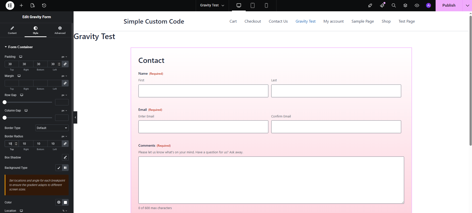
Gravity forms customization 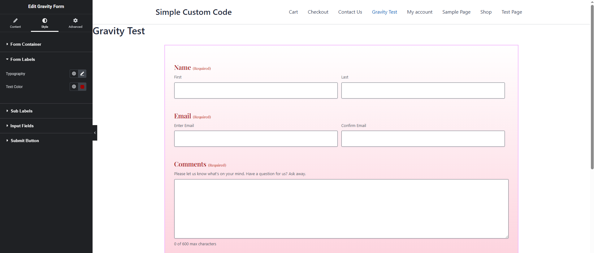
Gravity forms customization 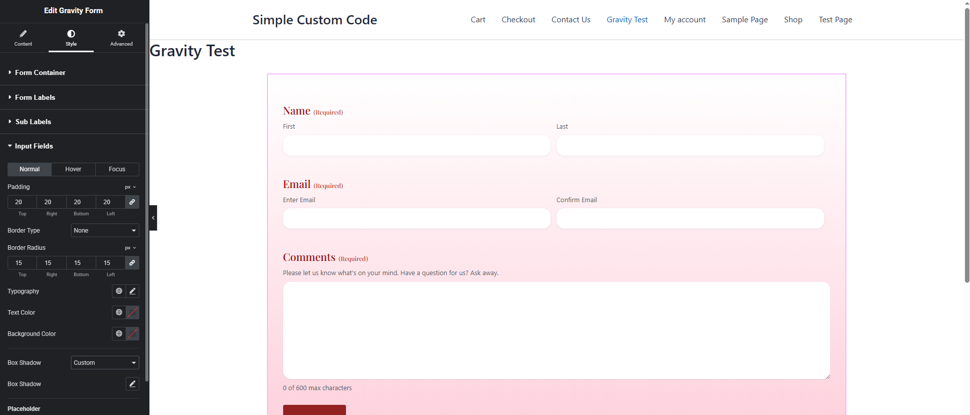
Gravity forms customization 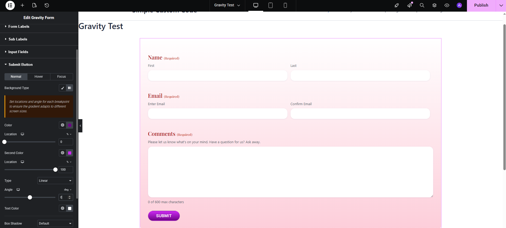
Gravity forms customization 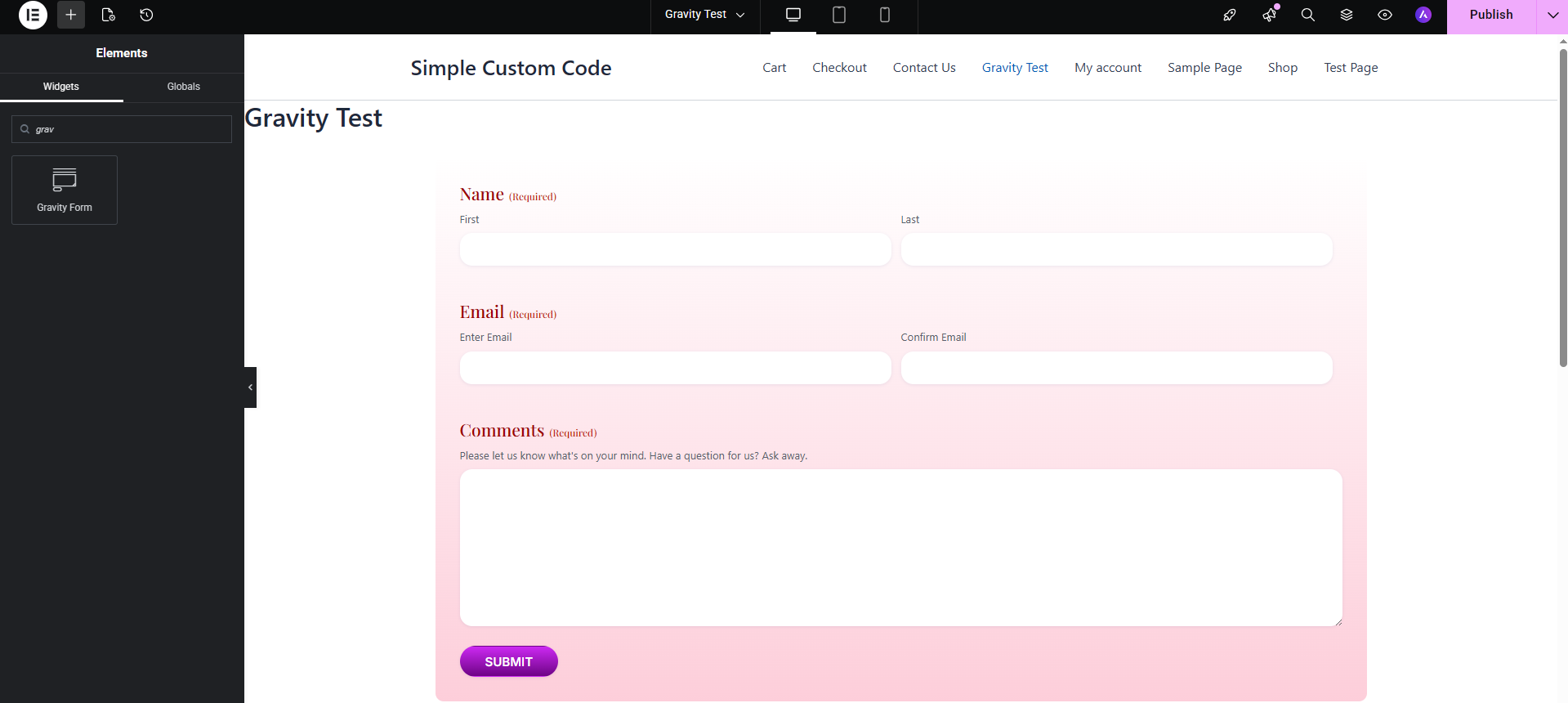
Gravity forms customization
Installation
- Upload the
form-styler-for-gravity-forms-and-elementorfolder to/wp-content/plugins/. - Activate the plugin through Plugins Installed Plugins in your WordPress dashboard.
- Make sure both Elementor and Gravity Forms are installed and active.
- Open any page or post in the Elementor editor.
- Search for “Gravity Form” in the widget panel (look under the Gravity Forms category).
- Drag the widget onto your canvas, select a form from the dropdown, and start styling.
FAQ
-
Does this work with the free version of Elementor?
-
Yes. The widget uses only core Elementor controls and APIs that are available in the free version of Elementor.
-
Which Gravity Forms version is supported?
-
The widget supports Gravity Forms 2.7 and higher. It is optimised for the Orbital theme introduced in Gravity Forms 2.5 and correctly handles the updated theme framework CSS and JavaScript structure introduced in Gravity Forms 2.9.
-
The form looks unstyled in the Elementor editor. What should I do?
-
This was a known issue in older versions of similar plugins caused by loading Gravity Forms styles into the wrong Elementor context. This plugin loads all required Gravity Forms styles and scripts into the Elementor preview iframe (not just the editor shell), so the form should render with full Orbital theme styling by default. If you are still seeing unstyled output, ensure that the Orbital theme is selected in Gravity Forms Settings Default Form Settings.
-
Can I use this plugin with Elementor Pro?
-
Yes. The widget is fully compatible with Elementor Pro and works alongside all Pro features including Theme Builder, dynamic tags, and custom breakpoints.
-
Does AJAX submission work when enabled?
-
Yes. Enabling the AJAX toggle passes
ajax="true"to the Gravity Forms shortcode. All standard Gravity Forms AJAX behaviour is preserved. -
Can I embed the same form more than once on the same page?
-
Yes. You can place multiple instances of the widget on the same page and target different forms or the same form with different settings. Use the Tab Index Start control to avoid duplicate tab index values when embedding the same form twice.
-
Is this plugin compatible with caching plugins?
-
Yes. The widget outputs standard Gravity Forms HTML via the official shortcode function. Compatibility with caching plugins follows the same rules as any other Gravity Forms shortcode embed.
-
How do I remove the browser focus outline from input fields?
-
In the Input Fields section, switch to the Focus tab, find the Outline control, and select None (remove outline). Note that removing outlines reduces keyboard accessibility, so consider replacing them with a visible box shadow instead.
-
This was a known issue where Gravity Forms’ own stylesheet could overwrite button styles depending on CSS load order. Fixed in version 1.1 — button styles now use increased specificity to reliably override the Gravity Forms defaults on both the editor preview and the published page.
Reviews
There are no reviews for this plugin.
Contributors & Developers
“Form Styler for Gravity Forms and Elementor” is open source software. The following people have contributed to this plugin.
Contributors
Translate “Form Styler for Gravity Forms and Elementor” into your language.
Interested in development?
Browse the code, check out the SVN repository, or subscribe to the development log by RSS.
Changelog
1.1.0
New — Input Fields
* Added Padding control (Normal tab) for inputs, textareas, and selects.
* Added Placeholder Color control (Normal tab) — targets the native ::placeholder pseudo-element and the legacy .placeholder class used by older Gravity Forms versions.
* Added Placeholder Typography control (Normal tab) — allows customising font family, size, weight, style, and letter spacing of placeholder text.
New — Submit Button
* Added a Focus state tab to the Submit Button section, matching the structure of the existing Normal and Hover tabs. Includes: background (solid or gradient), text color, border color, box shadow (Default / None / Custom), and outline (Default / None / Custom with color, width, and offset).
Fixed — Submit Button styles not applying on the front end
* Button styles set in the Elementor editor were visible in the preview but lost on the published page because Gravity Forms’ own stylesheet was overriding them by load order. Affected declarations (color, padding, border radius, border color, box shadow) now include !important so they reliably win over Gravity Forms defaults regardless of stylesheet enqueue order.
Fixed — “Select a form” placeholder appearing out of order in the dropdown
* Gravity Forms returns form IDs as integers. Assigning integer keys to an associative PHP array alongside an empty-string key caused PHP to reorder the array and push the placeholder option to the bottom of the list. Form IDs are now explicitly cast to strings, and the placeholder is merged using the union operator (+) to guarantee it always appears first.
1.0.0
- Initial release.